Peter J. Snyder
Corresponding to: Peter J. Snyder, Ph.D. Department of Art & Art History, College of Arts & Sciences, and Department of Biomedical & Pharmaceutical Sciences, College of Pharmacy, The University of Rhode Island, Kingston, RI, USA, pjsnyder@uri.edu
Care Weekly 2021;5:17-19
Published online June 2, 2021, http://dx.doi.org/10.14283/cw.2021.4
Hand strength and dexterity begin to diminish as we age, and holding everyday items like a traditional coffee mug can become difficult. The inability to properly grasp a mug of hot liquid is a common cause of burn injuries for the elderly. Brandy mitigated this home safety risk by designing a new mug that, although comfortable for elderly hands to hold, would be a pleasure for anyone to enjoy.
Brandy chose to design for the older range of the baby boomers (those born around 1946) – or people who were in their twenties during the 1960s, and so she created an inspiration board (Panel 2-2) that depicted the lifestyle of the user group she chose to study (young adults in the 1960s). To help us understand the context for her design, her image board (Panel 2-2) examined the home and family life of those she imagined using her mugs. She created a color palette, choice of materials, and a visual feeling that would be especially attractive to older adults who were raised in this era. The earth-toned colors, natural materials, and textures that she found – all dating from popular design elements in the 1960s – clearly shone through in her finished product.
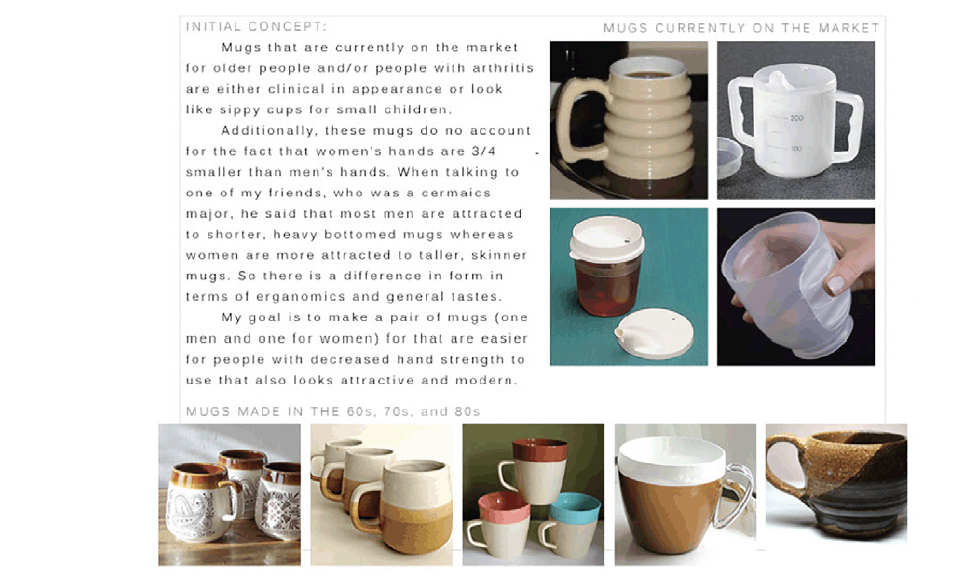
Concurrently with her consideration of aesthetic choices, Brandy looked at existing hot and cold liquid containers developed specifically for the elderly, mugs from the 1960s, 70s, and 80s. She drafted several revisions of her product statement, resulting in this final description of her initial concept (Panel 2-3):
“to create a pair of mugs that are easier for people with decreased hand strength to use that are also attractive and modern looking.
To amplify on the initial concept that Brandy listed (Panel 2-3), she expanded by stating that “since the handle seems to be the most problematic aspect of mugs, why does a coffee cup even need a handle?” Creating a mug with a ceramic interior that fits into a wooden base would not only eliminate the need for a handle, but it would keep liquid warmer for a longer period of time. Additionally, a ceramic interior would allow for easy clean up. Many cups currently on the market for people with arthritis are made of plastic and need to be washed by hand, which means lots of frustration and they often have either a ‘clinical’ appearance or they may look like “sippy cups” for small children. And, her goal was to “complete a well-rounded product that solves these problems, by relying on user-testing, protoypes and surveys to iterate and refine [her] ideas.”
It was Brandy’s careful attention to understanding the user experience, to choosing form and shape based on simple aesthetics, but to refine those shapes to meet the need of the target user group, that we appreciated so much in her work.
Identification of Basic Forms for Consideration
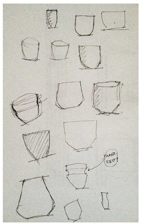
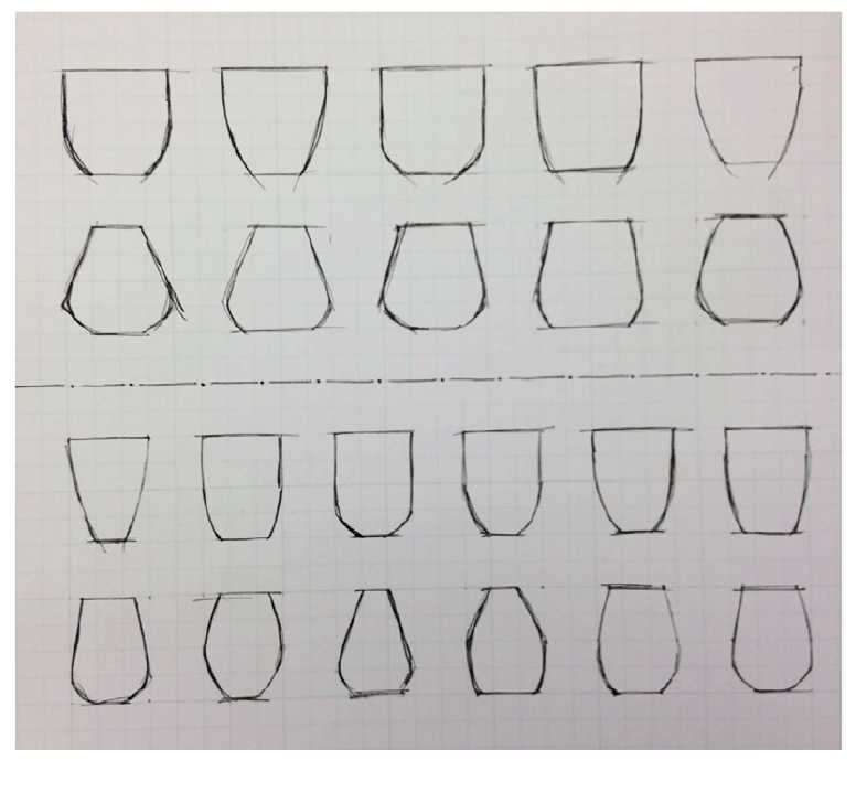
Something as simple as a drinking mug. How hard could this possibly be? There are actually a wealth of choices and decisions to make. Brandy first started with initial concept sketches (Panel 2-4), and a subset of these were then ‘standardized’ in order to compare across shapes in a more uniform manner (Panel 2-5).
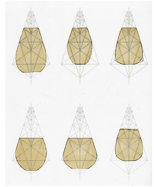
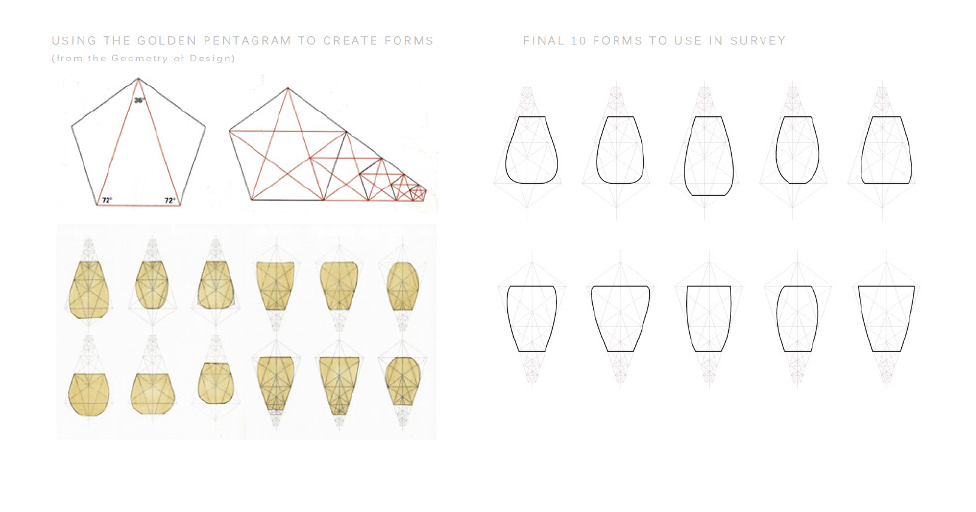
Her forms were then further refined based on an assignment to use of the “Golden Ratio” theorem, and its attendant “golden pentagram,”. This is a mathematical statement of perspective that may date back to the Ancient Greek mathematician, Euclid, and that has been relied on by countless architects, builders, designers and even musicians for the past 2,400 years (Panel 2-6).
Her work on this step resulted in 10 final forms that she chose to compare in an opinion survey (Panel 2-7).
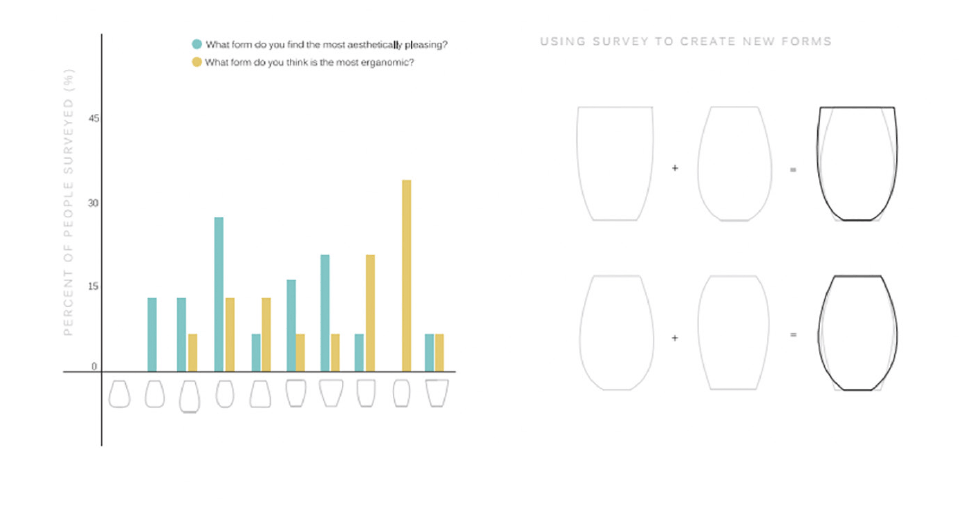
With her 10 candidate forms selected, she collected opinions via survey of her classmates, her professors, and at least 20 older adults whom she became acquainted with as a result of repeated class excursions to a local assisted care living facility. This allowed her to arrive at two final forms that were perceived to be BOTH aesthetically pleasing as well as ergonomic (easy to grasp, hold and use without accidental spills) (Panel 2-8).
Customizing her Chosen Form(s) For her Target User Group
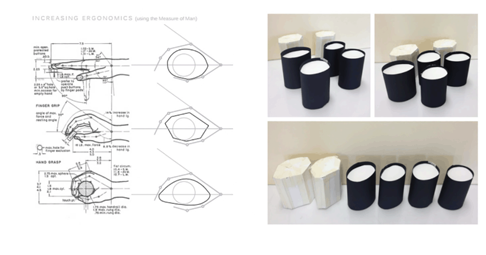
Brandy took her two candidate designs, and further refined them based on her study of the human hand (1), and the hands of the older adults she came to know as a result of repeated class visits to a local assisted care living facility. Her goal was to create a final form that was easy to grip, to hold, and to use without relying on fully intact upper motor strength and dexterity. She created many such forms in Styrofoam and in Plaster-of-Paris, and she brought them to the assisted care facility for field-testing (Panel 2-9).
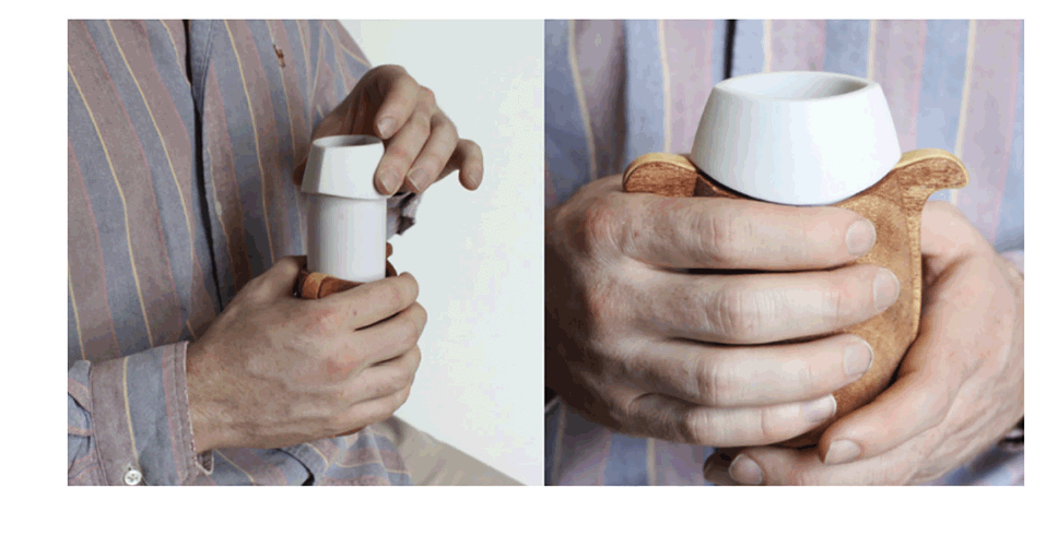
Her final form, brought forward for initial prototyping towards the end of her 14 week class term, included a 3D-printed ceramic insert that was watertight, had excellent insulation properties, was resistant to accidental breakage, and dishwasher safe. This insert was paired with a wood shell that allowed for eliminating the typical mug handle altogether, dispenses heat evenly, and also serves as a good insulator (Panel 2-10).
Brandy’s design and testing process clearly met her stated goal of designing a hot liquid mug that anyone would enjoy using, that is visually pleasing, and that allows for safe consumption of hot liquids by older adults with restricted grip strength or with arthritic conditions, but at the same time does not suggest any connection to medical or nursing home care. Imagine a home with objects as thoughtfully designed as this simple mug? This is a product that both encourages safety and independence, but is also one that avoids or removes any hint that the target user group requires special attention because they are damaged or impaired.
Conflicts of Interest
None
Reference
1. Dreyfuss, H. (A.R. Tilley, Ed.) (2002). The Measure of Man and Woman: Human Factors in Design, Vol. 1. New York, NY: Wiley. (Panel 2-9, left)

